

The reaction from residents to the new Osceola County logo unveiled at last week’s State of the County Address has been overwhelmingly negative.
County Commissioners addressed that at Monday’s meeting, but not before residents tried to speak about it during the “hear the audience” portion of the meeting.
One problem—current county guidelines prevent comment on items not on the meeting’s agenda. When one woman wanted to speak on it and refused to relent, she was removed from the meeting.
Current policy does allow for comments on items not on the agenda to be submitted in writing to the Clerk of the Board, and they will be shared with board members. The online portal is www.osceola.formstack.com/ forms/request_to_speak.
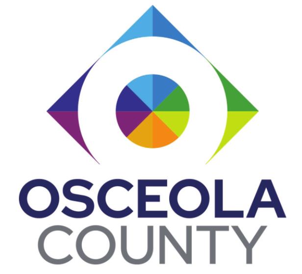
The new logo is part of a rebranding strategy of “Be First to What’s Next,” a forward-thinking idea to embrace new technology and projects taking place in the county.
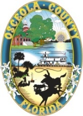
But critics, many longtime Osceola County residents, feel the change eliminates time honored traditions of ranching and, what the old logo included, steamboat travel on the Kissimmee River chain.
The county posted the logo to its Facebook page following the State of the County unveiling, and here’s a small sample of the comments:
“It’s rebranding all the county’s history away”;
“It does not represent what our county is about”;
“Cold, like a tech company logo. Devoid of meaning and purpose”;
“Nothing about this label that represents Osceola County”;
“This looks like NeoCity owns Osceola County now and we are no longer a proud agricultural county.”
County Commissioner Ricky Booth, a sixthgeneration county resident who works in the “heritage industry” of raising cattle, spoke level-headedly about the process of designing the new logo.
“I was 100 percent for going over it and freshening it up,” he said. “Public outreach began in November of 2020, and I got on this board in December. I thought we were headed in the right direction, so to me this has to be a starting point. I’d like to put together a focus group to get feedback from my district.”
Booth did also say he felt the new logo didn’t aptly capture Osceola’s heritage.
“I just think there wasn’t enough public feedback on the final product. I want us to have a brand we can all rally around,” he said.
While Commissioner Viviana Janer also said there was low engagement from residents in her district 2, she “didn’t see anything wrong with it,” when she first saw it prior to the unveiling.
The county also posted a page to its website (bit. ly/TheOsceolaBrand) which describes the logo and the process the county used form its rebranding strategy.
The new logo is described this way: “The bright, bold palette and design, evocative of a kaleidoscope refracting light into a multitude of color, symbolizes the diversity and inclusiveness of the Osceola County community and the “bright” future ahead.”
On that page, the county states, with a desire to honor its history, the previous Osceola County logo remains as the county seal and “was retained as a “Heritage” logo that can appear on official documents, proclamations and other appropriate uses.”

